The Long Con: A 5,000-Year History of Money, From Cattle to Quantitative Easing
How humanity went from trading cows to printing trillions — and what we lost along the way.
In November 1923, a German housewife named Anna Eisenmenger wrote in her diary that she had just paid 4 billion marks for a loaf of bread. A few weeks earlier, it had cost thousands. A few months before that, just a handful. By the time the nightmare ended, one American dollar was worth 4,210,500,000,000 German marks — a number so absurd it stopped meaning anything at all. Children played with bricks of banknotes in the street. Housewives burned stacks of marks in their kitchen stoves, because the paper was cheaper than the firewood it could buy.
That image — worthless money, piled high and set on fire — tells you something important about the thing in your wallet right now. Money is not wealth. It never was. Money is a story. A collectively agreed-upon fiction that only works as long as everyone keeps believing in it. And for the past five thousand years, the plot of that story has twisted in ways that no one could have predicted.
This is the story of how we got here.
Before the Coin: When Cows Were Cash
Here is a fact that would surprise most economists who came before the 1980s: the barter economy probably never existed. For generations, textbooks told the same origin story — that early humans swapped fish for firewood, that the "double coincidence of wants" was so inefficient that people naturally invented money. It was a clean, logical tale. It was also, by all available evidence, wrong.
Anthropologists who have studied indigenous societies across the world have found no evidence of any community where barter was the primary mode of exchange. What they found instead were complex systems of credit, obligation, and gift-giving — social debts tracked not in coins but in memory and reputation. The grocer didn't need exact change. He needed to know you were good for it.
Still, as communities grew larger and trade stretched beyond the village, something more portable and standardized was needed. Around 3000 BCE, civilizations across Mesopotamia and Africa settled on what may be the oldest form of money: cattle. Cows were valuable, widely desired, and reasonably uniform in worth. The very word "pecuniary," meaning "relating to money," derives from the Latin pecus, meaning cattle. When you hear someone described as "capital-rich," you're hearing an echo of the Latin capita — heads of livestock.
But cows have an obvious problem. You can't cut one in half to make change. You can't carry one across the Silk Road. You can't store a hundred of them in a vault. So civilizations began to search for something more practical.
In China, around 1500 BCE, the Shang Dynasty found its answer in nature: the cowrie shell. Harvested from the warm waters of the Pacific and Indian Oceans, these small, glossy shells were durable, portable, impossible to forge, and beautiful enough that people actually wanted them. They became the dominant currency across vast stretches of Asia, Africa, and the Pacific Islands — so dominant that the Chinese character for "money" (貝) is itself a pictograph of a cowrie shell. Remarkably, cowrie shells were still being used as money in parts of Africa as recently as the mid-twentieth century.
But the breakthrough — the invention that would change the trajectory of civilization — came from an unlikely kingdom on the western edge of what is now Turkey.
Around 610 to 600 BCE, in the ancient kingdom of Lydia, King Alyattes did something no ruler had done before. He minted standardized coins from electrum — a naturally occurring alloy of gold and silver found in the silt of the Pactolus River. Each coin bore the royal emblem of a lion's head, a stamp that guaranteed its weight and purity. These were the Lydian staters: the first government-issued, standardized coins in human history.
The genius wasn't the metal. It was the guarantee. By stamping his seal on each coin, the king was making a promise: this coin is worth what I say it is. You don't have to weigh it. You don't have to test it. Trust the stamp. Trust the crown.
It was, in a sense, the first monetary policy. And it worked. Within a generation, coinage had spread across the Greek world and into Persia. Merchants no longer needed to haul cattle or count shells. They carried something far more powerful: a king's word, pressed into metal.
The idea would prove contagious. But the real revolution in money — the one that would eventually unleash both extraordinary prosperity and extraordinary destruction — was still centuries away. And it would come not from the palaces of the Mediterranean, but from the river valleys of China.
The Paper Trail: China's Quiet Revolution
If you had walked through the bustling markets of Chengdu in the early eleventh century, you would have seen something that would not appear in Europe for another seven hundred years: paper money.
The invention wasn't born from genius. It was born from frustration. The Northern Song Dynasty (960–1127 CE) faced a problem that would be familiar to any modern central banker: they didn't have enough metal. Copper was scarce in the western provinces, so the government issued iron coins instead. But iron coins were heavy — brutally heavy. A string of one thousand iron coins weighed roughly eleven kilograms. Buying a horse, at twenty thousand wen, required an ox cart just to haul the payment.
So merchants in Sichuan province improvised. They began depositing their iron coins with financial firms and receiving paper receipts in return — receipts called jiaozi. These slips of paper could be traded, endorsed, and redeemed. They were, in every functional sense, the world's first paper currency.
By 1024 CE, the Song government took notice and did what governments have always done when private innovation works: they took it over. The state assumed control of jiaozi production, making it the first government-backed paper currency in history. The bills were printed on special paper, stamped with official seals, and issued with an expiration date to prevent hoarding.
For a while, it worked beautifully. Paper money greased the wheels of commerce in one of the most prosperous economies on earth. Song Dynasty China was a powerhouse of trade, innovation, and urbanization. But paper money came with a temptation that metal coins had never offered.
You can't print gold. You can print paper.
The Song government, and later the Yuan Dynasty under Kublai Khan, discovered this temptation the hard way. When the treasury ran short, they simply printed more. The Yuan Dynasty issued its chao banknotes with no metal backing at all — pure fiat currency, seven centuries before Richard Nixon made the same move. The result was rampant inflation that helped bring down the dynasty itself. It was a lesson that the world would forget and relearn again and again: printing money is easy. Maintaining trust in it is not.
Meanwhile, on the other side of the world, European merchants were inventing their own paper instruments — not money, exactly, but something close.
In the trading houses of thirteenth-century Florence, Venice, and Genoa, merchants faced a familiar dilemma. Carrying gold across bandit-ridden roads and pirate-infested seas was dangerous. And the Catholic Church had banned usury — the lending of money at interest — making traditional banking effectively illegal. Italian merchants, being Italian merchants, found a way around it.
The bill of exchange was an elegant workaround. A merchant in Florence could write a letter instructing his agent in London to pay a specified amount to a third party. No gold changed hands. No interest was technically charged (the profit was hidden in the exchange rate between currencies). The Church's prohibition on usury was technically respected, while credit flowed freely across Europe.
By 1397, Giovanni de' Medici formalized these innovations by founding the Medici Bank in Florence. The bank operated branches across Europe, managed papal finances, and pioneered double-entry bookkeeping. Florence became the financial capital of the Western world, and the Medici became its most powerful family — all built on the simple insight that money didn't have to be physical. It could be a record. A ledger entry. A promise.
It was a lesson that would shape everything that came next.
Gold, Banks, and the Architecture of Trust
The modern financial world was born in a single building. In 1694, the English Parliament chartered the Bank of England — not to serve the public, but to fund a war. King William III needed money to fight France, and a group of wealthy merchants agreed to lend him £1.2 million in exchange for a royal charter granting them the right to issue banknotes. It was the first modern central bank, and it established a template that would eventually be copied by every major nation on earth: a private institution with public authority, creating money through lending.
For the next century and a half, the world's monetary system remained a patchwork. Some nations used gold coins. Others used silver. Many used both, struggling with the so-called "bimetallic standard" that constantly fluctuated as the relative values of gold and silver shifted. It was messy, inefficient, and unpredictable.
Then, in the 1870s, the major economies of the world began to converge on a single standard: gold. Germany adopted the gold standard after its unification in 1871, using French war reparations to build its gold reserves. The United States effectively joined in 1879, followed by Japan, Russia, and most of the industrialized world by the 1900s. Under the gold standard, each country's currency was defined as a specific weight of gold, and paper money could be exchanged for gold on demand. Exchange rates between nations were fixed, because each currency was just a different-sized claim on the same metal.
The gold standard created stability. It also created a straitjacket.
When a country imported more than it exported, gold flowed out. When gold flowed out, the money supply contracted. When the money supply contracted, prices fell, wages fell, and people lost their jobs. The system was brutally self-correcting, but the corrections were brutal. Governments couldn't spend their way out of recessions. They couldn't adjust interest rates to stimulate growth. They were prisoners of their gold reserves.
The architects of the American system understood this danger — and tried to build a safety valve.
On December 23, 1913, after years of debate triggered by the devastating Panic of 1907, President Woodrow Wilson signed the Federal Reserve Act into law. The act created the Federal Reserve System — a network of twelve regional banks, controlled by a central board of presidential appointees, designed to act as a lender of last resort during banking panics. The Senate passed the bill 43 to 25 just hours before Wilson's signature. The Federal Reserve was meant to smooth out the wild booms and busts that had plagued American banking throughout the nineteenth century. Whether it succeeded is a question that economists are still arguing about.
Because just sixteen years later, the worst financial crisis in modern history proved that no amount of institutional architecture could prevent human folly.
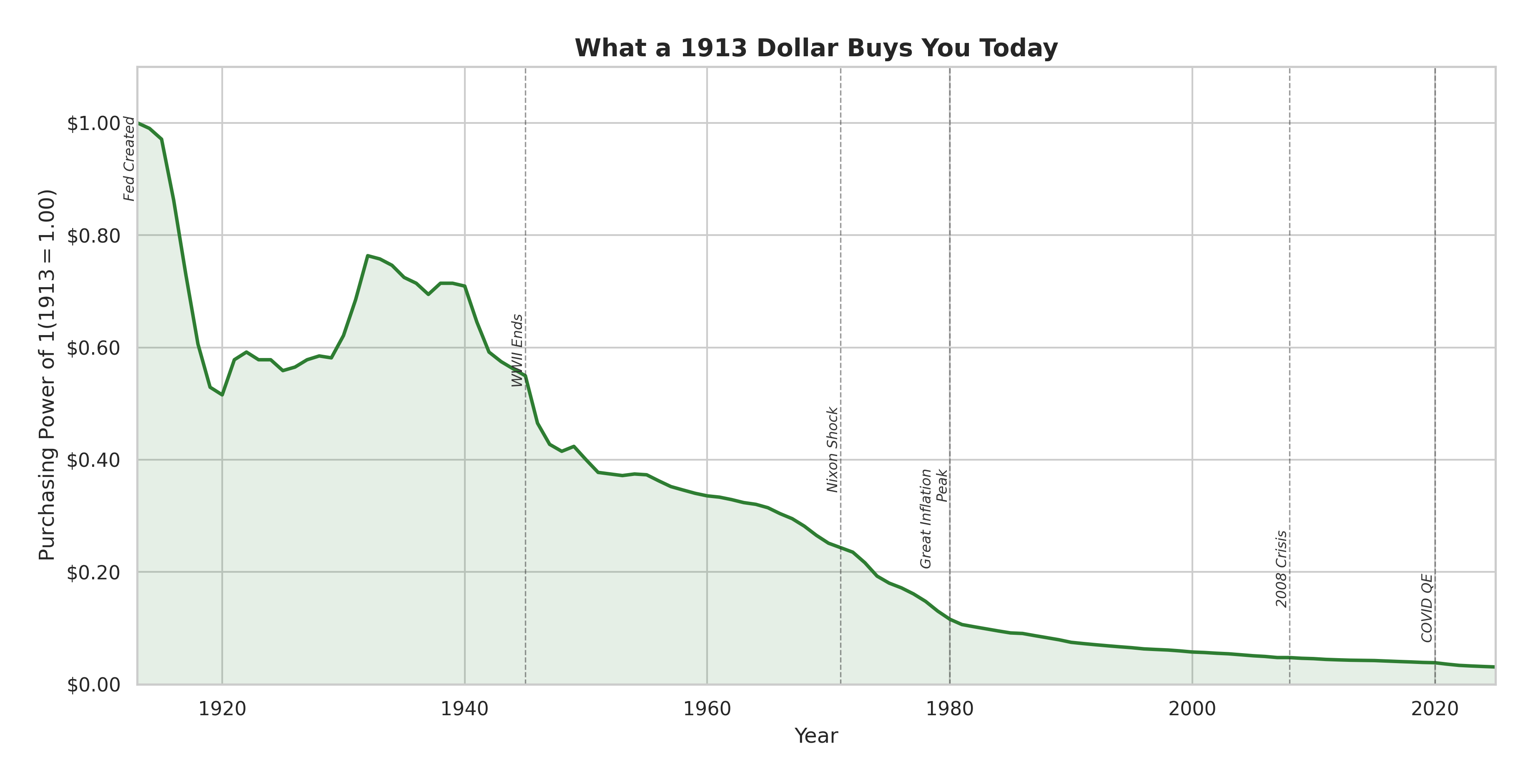
What a 1913 dollar buys you today. The green line tells the story of a slow-motion evaporation.
The chart above is one of the most sobering in all of economics. That green line starts at $1.00 in 1913 — the year the Federal Reserve was born — and it never makes it back. Look closely, though, and you'll notice something unexpected: the line doesn't just fall. It bounces. During World War I, prices spiked and purchasing power plunged to about $0.50. But then the deflationary 1920s and 1930s actually pushed it back up — by the depths of the Great Depression, a 1913 dollar had recovered to nearly $0.77. The Depression was catastrophic in every way, but it was one of the few periods in the past century where your money actually gained value.
That recovery was the last one. From the 1940s onward, the line only goes down. The steepest plunge came in two waves: the wartime inflation of the 1940s, which halved purchasing power in a decade, and then the brutal stretch from 1971 to 1982 — the Nixon Shock through the Great Inflation — which carved it from about $0.25 down to $0.12. After 1982, the decline slowed but never stopped. By the 2008 financial crisis, a 1913 dollar was worth roughly six cents. After the COVID-era money printing, it sits at about three to four cents. A dollar today buys roughly what three pennies bought when your great-grandparents were alive.
When Money Died: Weimar, 1923
Before we reach the Great Depression, we need to visit Germany. Because what happened there in 1923 remains the most vivid, most terrifying illustration of what happens when a government decides to solve its problems by running the printing press.
After World War I, Germany owed war reparations of 50 billion gold marks under the Treaty of Versailles — an astronomical sum for a nation already drowning in 156 billion marks of war debt. The government's solution was the same solution that had tempted the Song Dynasty: print more money.
By mid-1923, the Reichsbank had outsourced banknote printing to 133 private companies, running their presses day and night. The result was the most spectacular currency collapse in modern history. In January 1923, one dollar bought 17,972 marks. By November, it bought 4,210,500,000,000.
The human cost was staggering. A cup of coffee cost 5,000 marks — and by the time you finished drinking it, a second cup cost 7,000. Workers demanded to be paid twice daily so they could rush to the shops before prices rose again. Pensioners watched their life savings become worthless overnight. Farmers refused to sell food for marks and townspeople marched into the countryside to loot farms. Conspiracy theories flourished. Extremist political movements found fertile ground.
The crisis ended on November 15, 1923, when the government introduced a new currency — the Rentenmark — backed not by gold but by a mortgage on Germany's entire industrial and agricultural assets. It worked. Confidence was restored almost overnight. But the political scars never healed. The hyperinflation of 1923 didn't just destroy the German mark. As Smithsonian Magazine has documented, it helped destroy German democracy.
Black Thursday and the Great Unraveling
Six years later, the catastrophe moved west.
On October 24, 1929 — Black Thursday — the New York Stock Exchange crashed 11% at the opening bell. Panic selling cascaded through the trading floor. By the following Monday, the market had dropped another 12%. On Black Tuesday, October 29, it fell 11% more. In a single week, the speculative bubble of the Roaring Twenties had burst.
The causes were layered. A drastic 67% increase in the money supply between 1921 and 1929 had fueled a speculative frenzy. Declining interest rates encouraged overinvestment. Consumer debt had mounted. Industrial production was already slowing when the crash hit.
But the real damage came from the banking system. As the St. Louis Federal Reserve has documented, a series of banking panics between 1930 and 1933 caused 20% of American banks to fail. Depositors lost their savings. The remaining banks, terrified of further runs, stopped lending. Credit dried up. Businesses collapsed. Unemployment reached 25%.
The gold standard, which was supposed to ensure stability, made everything worse. As gold flowed out of countries running trade deficits, their central banks were forced to raise interest rates — exactly the opposite of what a depression demanded. The golden straitjacket tightened around the throats of economies already gasping for air.
It took a world war to end the Depression. And it took the aftermath of that war to build something new.
Bretton Woods: The Dollar Gets Its Crown
In July 1944, as Allied armies fought their way across Normandy, 730 delegates from 44 nations gathered at the Mount Washington Hotel in Bretton Woods, New Hampshire. Their mission: to design a new international monetary system that would prevent the chaos of the interwar years from ever happening again.
The resulting agreement, signed on July 20, 1944, was a compromise — but one that tilted decisively in America's favor. The United States, which at that point controlled two-thirds of the world's gold reserves, insisted that the new system rest on both gold and the U.S. dollar. Under Bretton Woods, the dollar was pegged to gold at $35 per ounce, and every other currency was pegged to the dollar within a narrow band of 1%.
The dollar had become the world's reserve currency. Foreign governments could exchange their dollars for gold at any time. American economic might guaranteed the system. It was elegant, stabilizing, and — as it turned out — unsustainable.
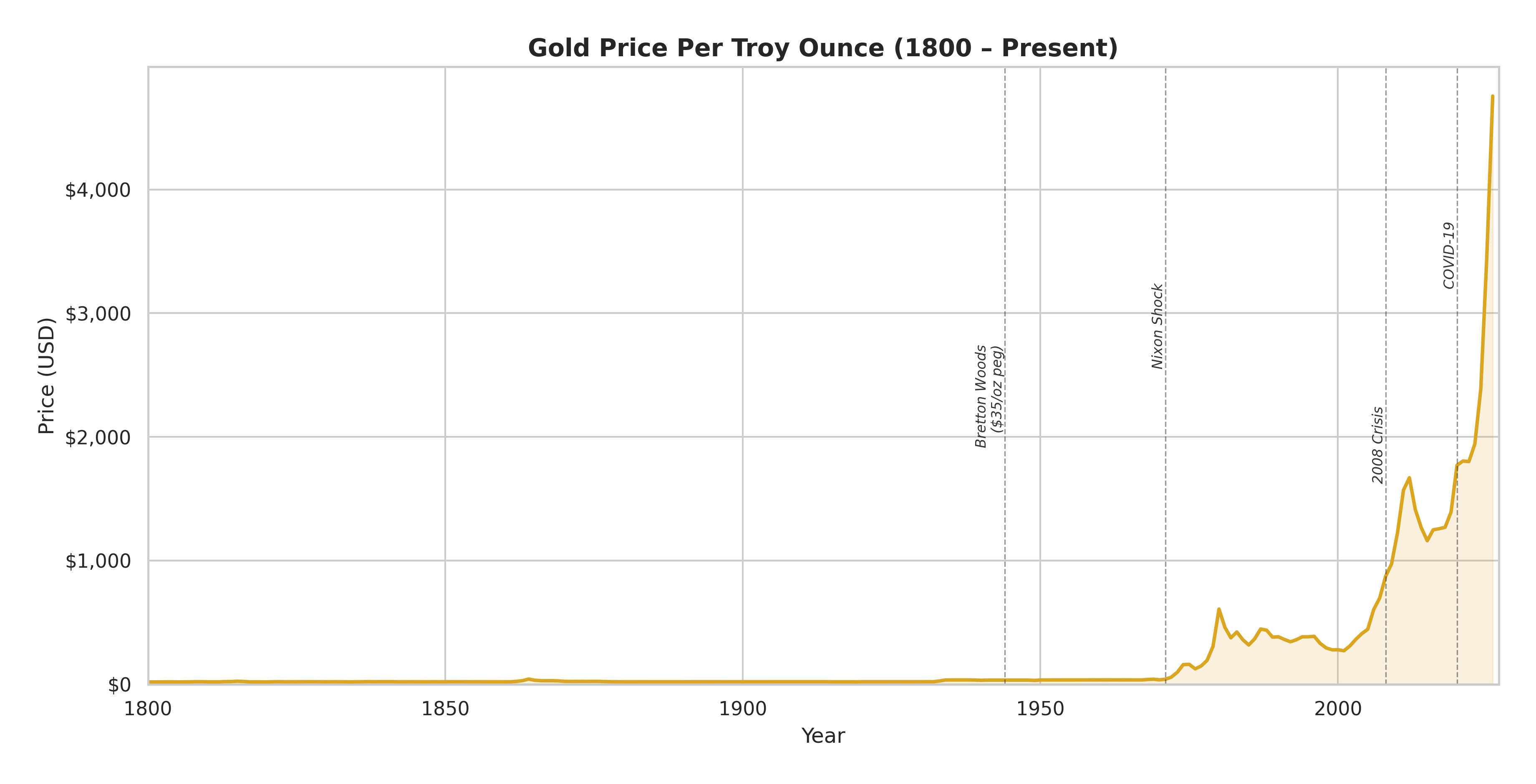
Gold price per troy ounce since 1800. For 170 years, the line barely registers above zero. Then the gold window closes — and the chart explodes.
Look at that chart. From 1800 to roughly 1970, the gold line is essentially flat — a faint amber trace hugging the bottom of the graph for over a century and a half. You can barely see the $35-per-ounce Bretton Woods peg. Gold was stable because governments said it was stable, and for a long time, the world believed them.
Then 1971 happens, and the chart cracks open. Once gold was no longer pegged to the dollar, its price became a mirror reflecting the world's anxieties. The first surge came during the Great Inflation, peaking around $650 per ounce in 1980 as oil shocks and runaway prices sent investors scrambling for something tangible. When Volcker tamed inflation, gold fell back — drifting between $300 and $500 through the calmer 1990s. The second surge came after the 2008 financial crisis, as quantitative easing flooded markets with new dollars and gold climbed past $1,800 by 2011. Investors who had watched the Fed's balance sheet balloon from $900 billion to $4.5 trillion wanted something governments couldn't print.
But the truly staggering move is the most recent one. From about $1,500 on the eve of the COVID-19 pandemic, gold has rocketed past $4,500 — a nearly threefold increase in just five years. That vertical spike at the right edge of the chart dwarfs everything that came before it. It is, in many ways, a vote of no confidence. When central banks create trillions of dollars in months, people reach for the one form of money that no government can manufacture. The 5,000-year-old metal, it turns out, still has something to say.
The Nixon Shock and the Great Inflation
On Friday, August 13, 1971, President Richard Nixon gathered a small group of advisors at Camp David for a secret weekend meeting. Among them were Federal Reserve Chairman Arthur Burns, Treasury Secretary John Connally, and a young undersecretary named Paul Volcker — a man who would later play a very different role in this story.
The problem was simple and devastating. The United States had been spending lavishly — on the Vietnam War, on foreign aid, on domestic programs — and the rest of the world was starting to notice. There were now four times as many dollars in circulation as there was gold in American vaults to back them. Foreign governments, led by France, had begun demanding gold for their dollars, testing the $35-per-ounce promise that underpinned the entire global monetary system.
On Sunday, August 15, Nixon went on national television and suspended the convertibility of the dollar into gold. He called it temporary. It wasn't. The gold window slammed shut and never reopened.
As the U.S. State Department's own historians note, the "Nixon Shock" effectively converted the U.S. dollar from a gold-backed currency into a fiat currency — money backed by nothing but the full faith and credit of the United States government. By 1973, the fixed exchange rate system was dead. Currencies around the world began to float freely, their values determined not by gold reserves but by supply and demand on foreign exchange markets.
The world had entered uncharted territory. And it showed.
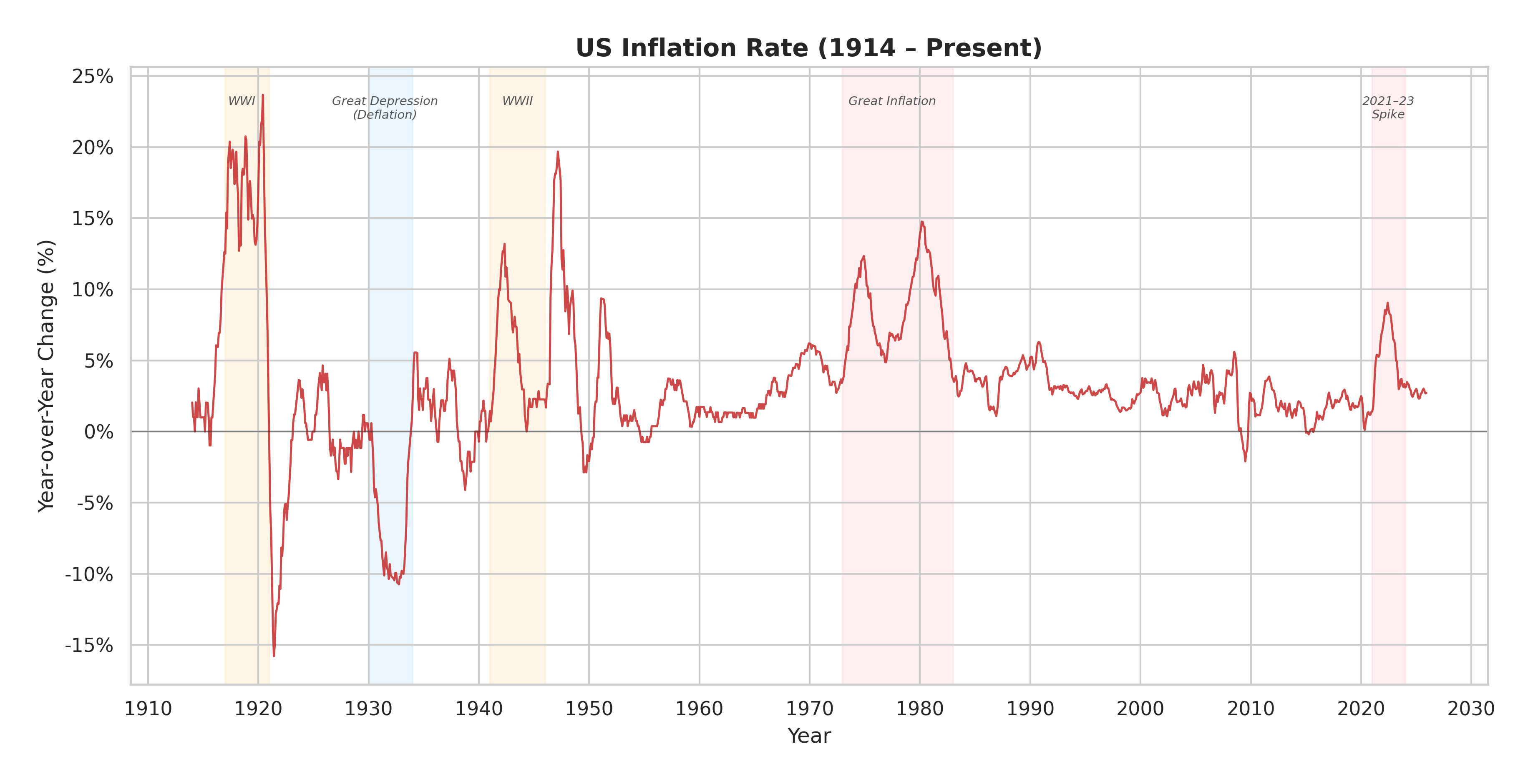
Over a century of US inflation. Each colored band marks a crisis — and the red line tells you exactly how violent the price swings were.
The inflation chart above reads like an electrocardiogram of a patient in distress. In the early decades, the heartbeat is wild. World War I sent prices spiking past 20% — the highest peak on the entire chart — as the government printed money to fund the war effort. Then came the crash: by 1921, deflation had dragged the rate to nearly -15%, a whipsaw of more than 35 percentage points in just three years.
The Great Depression shows up as the deep blue-shaded trough around 1930-1933, where prices fell by more than 10% annually. People couldn't find work, and the things they needed to buy were getting cheaper — a cruel irony when nobody had money to spend. World War II brought another inflationary spike, peaking around 20% in the immediate postwar period of 1947 as pent-up demand collided with constrained supply.
Then look at what happens from the mid-1960s onward. The red-shaded band of the Great Inflation stretches from 1973 to 1982 — a sustained period where the line rarely dips below 5% and peaks near 15% in 1980. This wasn't a spike. It was a plateau. For nearly two decades, Americans lived in a world where the value of their savings eroded year after year.
But perhaps the most revealing feature is what comes after. From about 1985 to 2020 — thirty-five years — the red line narrows into a remarkably stable band between roughly 1% and 5%. Economists called it the "Great Moderation." Central bankers congratulated themselves. And then the 2021-23 spike, shaded pink at the chart's far right, shattered the calm — inflation surging to 9%, a painful reminder that the monster never really died. It was only sleeping.
The decade that followed the Nixon Shock was an economic nightmare. Freed from the discipline of gold, governments printed money with abandon. Two oil crises — in 1973 and 1979 — sent energy prices soaring. Wages chased prices. Prices chased wages. By January 1980, U.S. inflation had hit 14%. The era would later be called the Great Inflation, and it lasted from 1965 to 1982 — seventeen years of eroding purchasing power that punished savers, terrorized retirees, and shook public faith in the dollar.
The cure was almost as painful as the disease. In August 1979, Paul Volcker — the same man who had been in the room at Camp David — became chairman of the Federal Reserve. His prescription was radical: raise interest rates until inflation broke, no matter the cost. By June 1981, the federal funds rate had reached 20%. Mortgages became unaffordable. Businesses folded. Unemployment soared. Farmers, unable to service their debts, blockaded the Federal Reserve headquarters with tractors.
But Volcker held firm. By 1983, inflation had fallen to 3.2%. The fever had broken. The price was two brutal recessions and millions of lost jobs. The lesson, for those paying attention, was that once inflation takes root, uprooting it exacts a terrible toll.
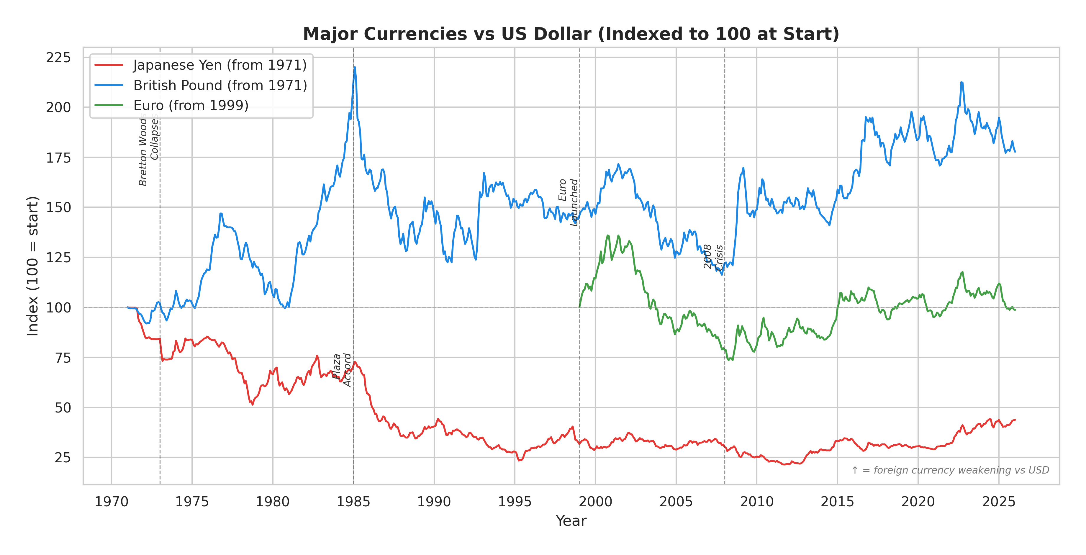
Three currencies, three very different stories. The chart tracks how many units of each foreign currency it costs to buy one U.S. dollar, indexed to 100 at each start date. When a line goes up, that currency is losing value against the dollar. When it goes down, that currency is gaining strength.
The exchange rate chart needs a moment to unpack, because the direction can be counterintuitive. Think of it this way: if you're Japanese and the line goes up, it means you need to hand over more yen to get the same dollar. That's bad for the yen. If the line goes down, you need fewer yen per dollar. That's the yen getting stronger. The same logic applies to all three currencies.
With that in mind, the three lines tell very different stories about the post-Bretton Woods world.
The red line is the Japanese yen, and its trajectory is remarkable. In 1971, one dollar bought about 360 yen. Over the next twenty-five years, that number plummeted — by the mid-1990s, one dollar bought only about 80 yen. On the chart, this shows up as the red line falling from 100 to roughly 30. The yen was strengthening massively as Japan transformed itself into the world's second-largest economy, running enormous trade surpluses that drove global demand for its currency. The sharpest drop — a visible cliff on the chart — comes around 1985, when the Plaza Accord, a coordinated agreement between the United States, Japan, West Germany, France, and the United Kingdom, deliberately weakened the dollar against the yen and other currencies. The effect was immediate and dramatic.
But look what happens after 2012: the red line reverses and climbs back toward 40-45. That's the yen weakening again — from about 80 yen per dollar back to over 150 yen per dollar by recent years. The Bank of Japan, desperate to fight decades of deflation and economic stagnation, pursued its own massive money-printing campaign. The result: the yen gave back much of its post-war gains. In the span of fifty years, it went from explosive strength to quiet erosion.
The blue line — the British pound — tells a different story. In 1971, one pound bought a hefty $2.50. That made the pound one of the strongest currencies in the world. But the line moves steadily upward, meaning it took more and more pounds to buy a dollar as the decades passed. By the early 1980s, the index pushes above 200, reflecting a period when the pound collapsed against the surging Reagan-era dollar — falling from $2.50 to roughly $1.20 at its weakest point. The Plaza Accord helped the pound recover somewhat, but it never returned to its 1971 glory. Today, one pound buys about $1.25 — still more than a dollar in absolute terms, but half of what it was worth five decades ago. That long erosion from $2.50 to $1.25 is the story the rising blue line is telling.
The green line — the euro, entering the chart only in 1999 — is the shortest and most volatile of the three. It weakened sharply in its first year, as markets tested the brand-new currency. Then it strengthened dramatically, with the index dropping to near 75 by 2008 — meaning it took fewer euros per dollar, reflecting a strong euro that at its peak bought $1.60. The 2008 financial crisis whipsawed it back. Since then, the euro has oscillated around its starting value, never settling into a clear trend. If the yen tells a story of rise and fall, and the pound tells a story of long decline, the euro tells a story still searching for its ending.
The Tiger Falls: Asia, 1997
The post-Bretton Woods era of floating exchange rates created a new kind of vulnerability — one that became catastrophically visible in Southeast Asia.
On July 2, 1997, the government of Thailand did something it had desperately tried to avoid: it floated the baht. The currency, which had been pegged to the U.S. dollar, immediately lost half its value. The collapse was the culmination of months of speculative pressure that had drained Thailand's foreign exchange reserves to near zero.
The causes ran deeper than speculation. As the Federal Reserve History project has documented, years of rapid, poorly supervised credit growth had created massive financial leverage throughout the region. Banks had borrowed heavily in dollars — cheap and abundant — and lent in local currencies. Real estate prices had ballooned. When the peg broke, the local-currency value of those dollar debts exploded overnight. Companies that had been profitable on paper were suddenly insolvent.
The contagion spread with terrifying speed. Within months, the crisis had engulfed Indonesia, South Korea, Malaysia, and the Philippines. The IMF stepped in with emergency loans totaling over $100 billion — the largest financial rescue in history at that time. The conditions attached to those loans were controversial and, in several cases, made things worse before they got better.
The Asian Financial Crisis was a dress rehearsal. The main event was still a decade away.
The Money Printers: Crises and Intervention in the Twenty-First Century
The story of the 2008 financial crisis begins not in the marble halls of Wall Street but in the living rooms of suburban America, where millions of families were signing mortgage documents they didn't fully understand for homes they couldn't actually afford.
During the early 2000s, a housing bubble inflated across the United States, fueled by historically low interest rates, aggressive lending practices, and a widespread belief that home prices could only go up. Banks issued mortgages to borrowers with poor credit — so-called "subprime" loans — and then bundled thousands of these mortgages together into complex financial products called mortgage-backed securities, or MBS. These bundles were sliced, repackaged, and sold to investors around the world. Rating agencies stamped many of them with AAA ratings, the highest grade of safety.
It was, as the Center for American Progress later described it, a house of cards built on a foundation of bad debt.
When interest rates rose and housing prices began to fall in 2006 and 2007, the cards started falling. Borrowers defaulted. Foreclosures surged. The MBS that banks and hedge funds held on their books — supposedly safe assets — turned out to be toxic. On September 15, 2008, Lehman Brothers, one of the oldest and largest investment banks in America, filed for bankruptcy. The global financial system froze.
What followed was the most aggressive government intervention in financial history. The Federal Reserve, as its own historians acknowledge, slashed interest rates to near zero — and when that wasn't enough, it reached for a tool it had never used before: quantitative easing.
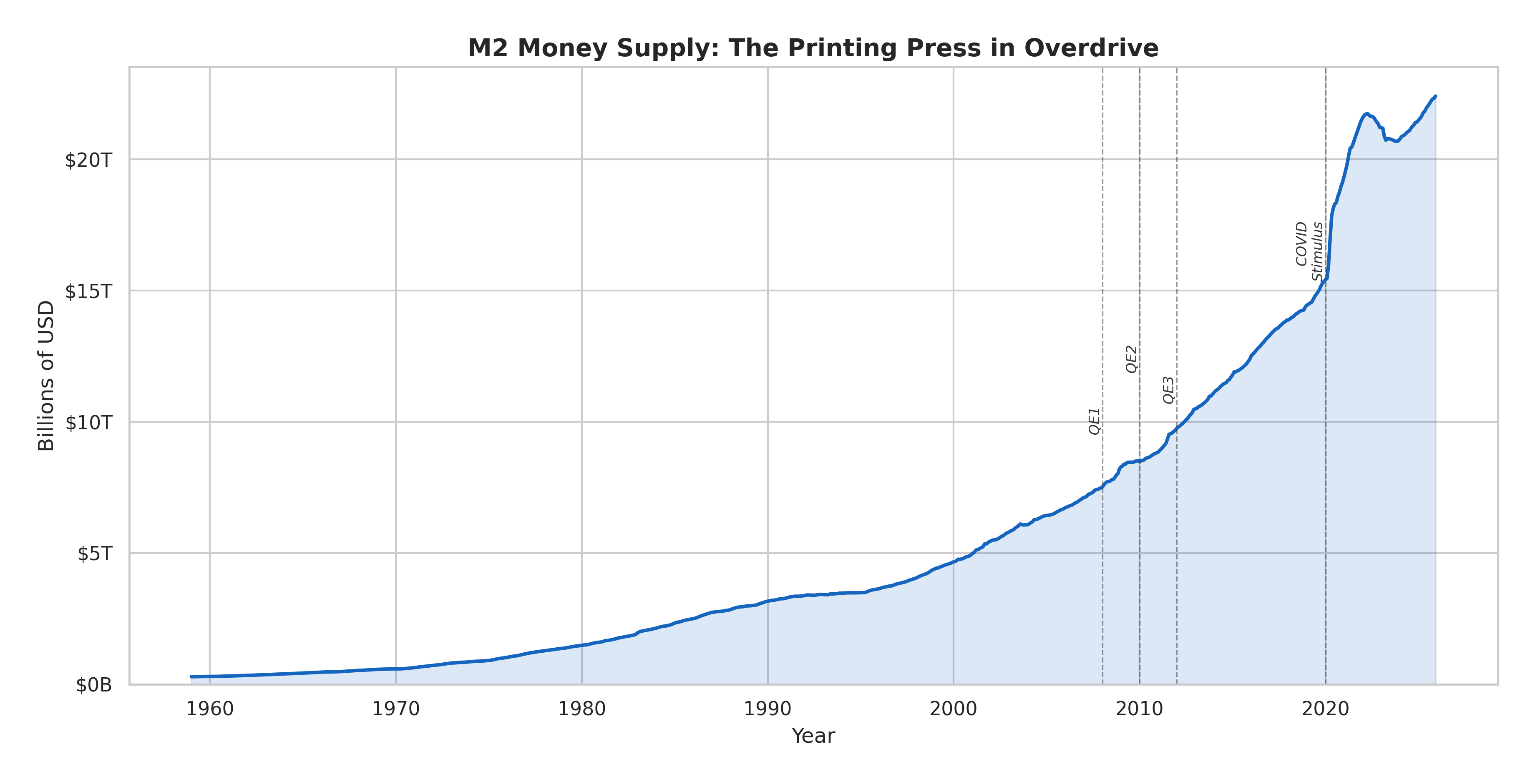
The blue line is the total money sloshing around the U.S. economy. That near-vertical spike in 2020? That's roughly $6 trillion appearing in under two years.
If one chart could explain the last five years of grocery bills, rent hikes, and political anger, it might be this one. The M2 money supply — which includes cash, checking deposits, savings accounts, and money market funds — is a rough measure of how much money exists in the economy. And the shape of that blue line tells you everything.
From 1959 through the 1970s, the curve is barely visible — a gentle upward slope near the bottom of the chart, growing from a few hundred billion to maybe a trillion dollars over two decades. Through the 1980s and 1990s, the climb steepens, reaching about $5 trillion by 2000. The three QE programs after 2008 are visible as a quickening of the slope — each one marked with a dashed line on the chart — pushing M2 from about $8 trillion to $15 trillion over the following decade.
And then comes 2020. The COVID stimulus turns the gradual curve into what looks like a wall. M2 rockets from roughly $15 trillion to $21 trillion in barely eighteen months — the most dramatic vertical move on a chart that spans six decades. Nothing before it, not even the combined effect of all three QE programs, comes close.
Look at what happens next, though. Around 2022-2023, there's a visible dip — the first sustained decline in M2 in the chart's history. That's the Fed's attempt at quantitative tightening: pulling money back out of the system, trying to undo what it had done. The dip is modest — a drop from about $21 trillion to $20 trillion — before the line resumes its upward march toward $22 trillion and beyond. The Fed tried to put the toothpaste back in the tube. It got about five percent of it.
Quantitative Easing: When Zero Isn't Enough
Quantitative easing — QE — sounds technical. The reality is simpler and more alarming. When a central bank purchases government bonds and other financial assets in massive quantities, it is essentially creating new money and injecting it into the financial system. The goal is to push down long-term interest rates, encourage lending, and stimulate economic activity. The side effect is that the money supply expands dramatically.
The Federal Reserve launched QE1 in November 2008, purchasing over $1.7 trillion in Treasury securities and mortgage-backed securities. When the economy continued to sputter, QE2 followed in November 2010, and QE3 in September 2012. By the time the programs ended, the Fed's balance sheet had swollen from roughly $900 billion to over $4.5 trillion.
Critics warned about inflation. It didn't come — at least not immediately. Asset prices surged instead. Stock markets boomed. Real estate recovered. But as the Chicago Booth Review has explored, the benefits were unevenly distributed. Those who owned assets — stocks, bonds, real estate — saw their wealth grow. Those who didn't were left behind. Income inequality, already widening, accelerated.
Then came 2020, and the money printers went into overdrive.
When the COVID-19 pandemic shut down the global economy in March 2020, the Federal Reserve's response made its 2008 interventions look restrained. In a matter of weeks, the Fed launched unlimited QE, purchasing assets at a pace of $120 billion per month. The federal government, meanwhile, passed stimulus bills totaling approximately $5 trillion. The M2 money supply — the broadest commonly used measure of money in circulation — spiked by roughly 40% in two years. It had taken decades to grow from $286 billion in 1959 to $15 trillion in early 2020. It hit $21 trillion by the end of 2021.
This time, the inflation did come. By June 2022, the Consumer Price Index showed year-over-year inflation of 9.1% — the highest in four decades. The Fed, having spent years keeping rates near zero, was forced into the fastest rate-hiking cycle since the Volcker era. History, once again, rhymed.
The Currency Game: Manipulation, Disparity, and the Uneven Playing Field
If money is a story, then exchange rates are the global argument over whose story is more convincing.
Since the collapse of Bretton Woods, governments have not simply let their currencies float free. Central banks routinely intervene in foreign exchange markets — buying or selling their own currency to influence its value. Japan and Switzerland have intervened repeatedly to weaken their currencies and protect their export industries. China has been accused for decades of deliberately keeping the yuan undervalued to make its manufactured goods cheaper on world markets. Russia has used its reserves to defend the ruble during periods of geopolitical stress.
The IMF officially prohibits currency manipulation for trade advantage, but enforcement has always been more aspirational than effective. The result is a global monetary system where the rules exist on paper but power determines the practice.
And then there is the deeper, more structural inequality: the vast disparity in what money actually buys in different countries.
Economists measure this through purchasing power parity, or PPP — an attempt to equalize currencies based on what a basket of goods actually costs in each country. The most famous (and most delicious) version is The Economist's Big Mac Index, which compares the price of a McDonald's hamburger across nations as a rough-and-ready measure of currency valuation.
The numbers are stark. According to World Bank data, a dollar in the United States and a dollar's equivalent in India buy very different things. India's nominal GDP per capita is roughly $2,500. Adjusted for purchasing power, it's closer to $9,000. The gap between those two numbers represents the gulf between market exchange rates — which reflect financial flows, speculation, and geopolitics — and the reality of daily life.
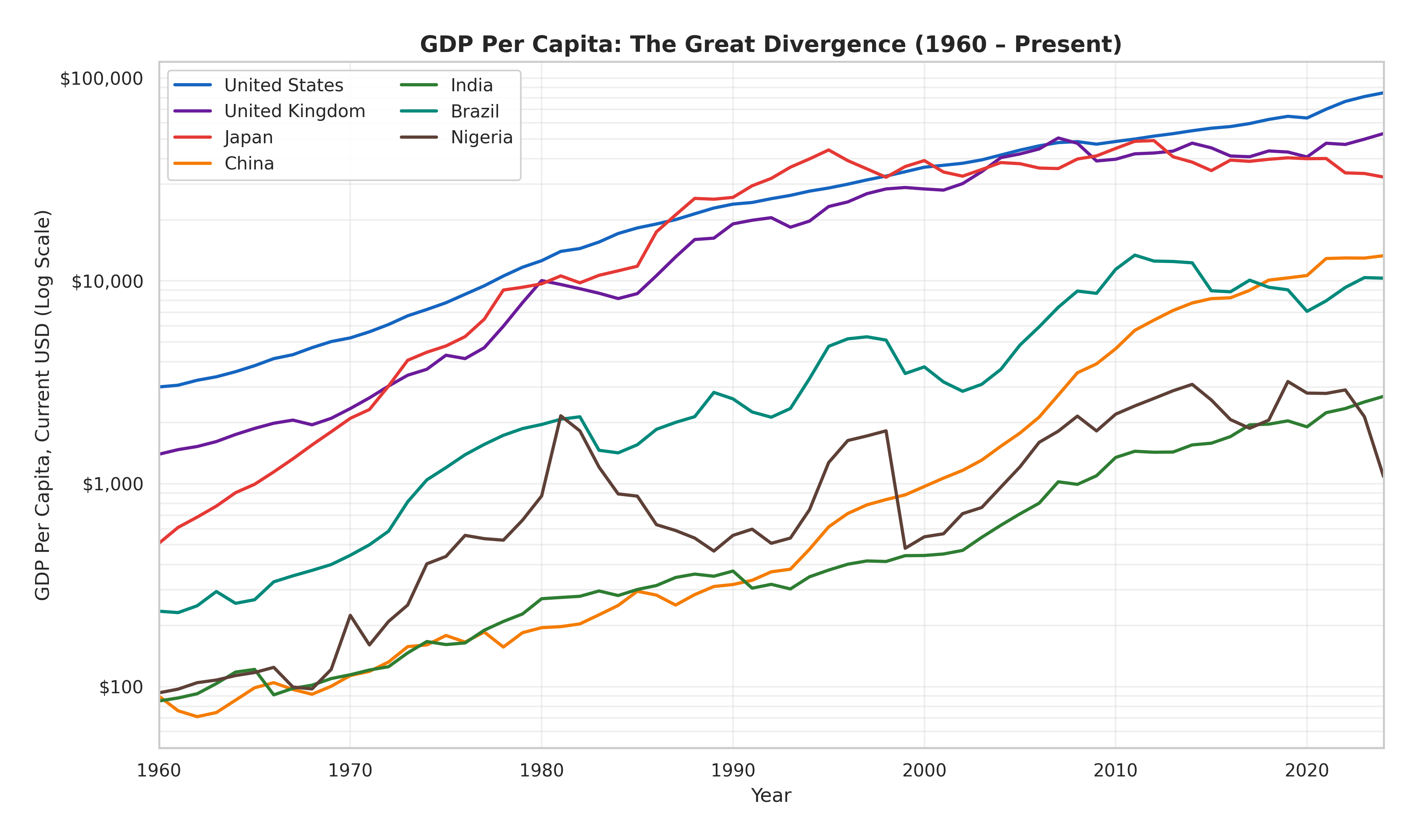
Seven countries, six decades, one logarithmic scale. The lines at the top earn in a day what the lines at the bottom earn in a week.
The GDP chart above uses a logarithmic scale — which means equal vertical distances represent equal percentage growth, not equal dollar amounts. That's important, because it lets you see something a normal chart would hide: the rates at which different countries are growing, not just their absolute levels.
Start at the top. The United States (blue) and the United Kingdom (purple) trace near-parallel lines from upper left to upper right — a steady upward march from a few thousand dollars per person in 1960 to roughly $80,000 and $50,000 respectively by the 2020s. These are the economies that wrote the rules of the modern financial system. Their lines are stable, predictable, and — for billions of people living below them — unreachable.
Now look at Japan (orange). It is the chart's most dramatic rags-to-riches story — and its most cautionary tale. In 1960, Japan's GDP per capita was barely $500, lower than Brazil's. By the late 1980s, it had rocketed to nearly $40,000, its line climbing at the steepest angle on the chart. Then it stops. From the 1990s onward, Japan's line flattens and even declines in recent years, dipping to around $30,000-35,000. The "Lost Decades" of deflation and demographic decline show up as the only top-tier line on the chart that bends sideways. In current dollar terms, Japan has gone backward.
China (red-orange) tells the opposite story. Its line is essentially flat from 1960 to 1980 — a horizontal slash near the bottom of the chart at roughly $100 per person during the Mao era. Then Deng Xiaoping's reforms arrive, and the line tilts upward. Slowly at first, then faster, then much faster. By 2024, China has climbed from under $100 to roughly $12,000-13,000 — a more than hundredfold increase. It is the steepest sustained ascent on the chart, and it has transformed the global economy. China's line has crossed Brazil's and is converging on Japan's declining trajectory. If these trends hold, the crossing is a matter of years, not decades.
India (green) follows a similar shape but with a twenty-year delay — nearly flat until the early 2000s, then steepening as economic liberalization and a technology boom took hold. India has climbed from about $80 in 1960 to roughly $2,500-3,000 — impressive growth, but still far below China and a full order of magnitude below the rich world.
Brazil (teal) is the chart's cautionary tale about commodity dependence. Its line surges in the 1970s, crashes through the 1980s hyperinflation era (visible as a sharp dip), recovers through the 2000s commodity boom to peak around $13,000 in 2011-2013, then falls back to $8,000-10,000. It's the most volatile line on the chart — a country that has repeatedly climbed toward the middle class only to slide back down.
And then there is Nigeria (brown), clinging to the bottom of the chart. Starting at about $100 in 1960, it experienced an oil-driven bump to around $2,500-3,000 in the early 2010s — then crashed as oil prices fell. Today it sits around $1,500-2,000, barely higher in real terms than it was thirty years ago. For all the talk of convergence, Nigeria is the line that reminds you: not everyone has been invited to the party.
This disparity is not accidental. It is the cumulative result of centuries of uneven development, colonial extraction, institutional differences, and — crucially — monetary policy. Countries with stable currencies, independent central banks, and deep capital markets tend to attract investment, which strengthens their currencies further. Countries without those institutions struggle to borrow in their own currencies, leaving them dependent on the dollar and vulnerable to external shocks — a phenomenon economists call "original sin."
The playing field has never been level. And while the gap between the richest and poorest countries has narrowed somewhat in recent decades — largely due to China's extraordinary economic rise — it remains one of the defining features of the global economy.
The Story That Never Ends
Stand back far enough, and the history of money reveals a single, recurring pattern. Human beings invent a form of money. It works. Prosperity follows. Then someone — a king, a government, a bank — discovers they can create more of it. They do. Confidence erodes. Crisis follows. A new form of money replaces the old one. The cycle begins again.
Cattle gave way to cowrie shells. Shells gave way to coins. Coins gave way to paper. Paper gave way to digits on a screen. Gold-backed money gave way to fiat money. Fiat money may yet give way to something else — digital currencies, perhaps, or some form we haven't imagined.
But through every transformation, one thing has remained constant: money works only as long as people believe it works. The Lydian stater worked because people trusted the king's stamp. The Song Dynasty jiaozi worked because people trusted the government's seal. The dollar works because people trust the Federal Reserve, the United States military, and the $25 trillion American economy that stands behind it.
That trust is not guaranteed. It has been broken before — in Weimar Germany, in Zimbabwe, in Venezuela. It has been strained in the United States itself, during the Great Inflation and again during the post-pandemic price surge.
The German housewife burning marks in her kitchen stove in 1923 would recognize something in the M2 money supply chart, with its sharp vertical spike after 2020. She might not have the vocabulary of modern economics. But she would understand the shape of that curve. She had lived inside it.
The story of money is the story of trust — extended, abused, broken, and rebuilt. It is the longest-running confidence game in human history. And the next chapter, as always, is being written right now.
All data visualizations generated from public datasets provided by the Federal Reserve Economic Data (FRED), the World Bank Open Data, and Free Gold API.
Sources and Further Reading
- History of Money — Wikipedia
- The Importance of the Lydian Stater as the World's First Coin — World History Encyclopedia
- Shell Money — Wikipedia
- Song Dynasty: Economy and Money — Columbia University, Asia for Educators
- Jiaozi (Currency) — Wikipedia
- The Medieval Bill of Exchange — University of Toronto
- History of Banking — Wikipedia
- Overview: The History of the Federal Reserve — Federal Reserve History
- The Senate Passes the Federal Reserve Act — U.S. Senate
- Hyperinflation in the Weimar Republic — Wikipedia
- How Hyperinflation Heralded the Fall of German Democracy — Smithsonian Magazine
- The 1923 Hyperinflation — Alpha History
- Great Depression — Wikipedia
- 5 Causes of the Great Depression — HISTORY
- Economic Episodes in American History — St. Louis Federal Reserve
- Creation of the Bretton Woods System — Federal Reserve History
- Bretton Woods System — Wikipedia
- Nixon Shock — Wikipedia
- Nixon Ends Convertibility of U.S. Dollars to Gold — Federal Reserve History
- Nixon and the End of the Bretton Woods System — U.S. State Department
- Floating Exchange Rate — Wikipedia
- Historical Inflation Rates: 1914–2026 — US Inflation Calculator
- The Great Inflation — Federal Reserve History
- 1997 Asian Financial Crisis — Wikipedia
- Asian Financial Crisis — Federal Reserve History
- The Asian Crisis: Causes and Cures — IMF
- Subprime Mortgage Crisis — Wikipedia
- Subprime Mortgage Crisis — Federal Reserve History
- The 2008 Housing Crisis — Center for American Progress
- Quantitative Easing — Wikipedia
- History of Quantitative Easing in the U.S. — ADM
- How Quantitative Easing Actually Works — Chicago Booth Review
- Currency Intervention — Wikipedia
- When Foreign Exchange Intervention Can Best Help Countries — IMF
- Purchasing Power Parity — Wikipedia
- PPP Conversion Factor — World Bank
- Federal Reserve Act — Wikipedia
- History of Chinese Currency — Wikipedia
- QE and the "New Normal" in Monetary Policy — Federal Reserve Board